.svg)
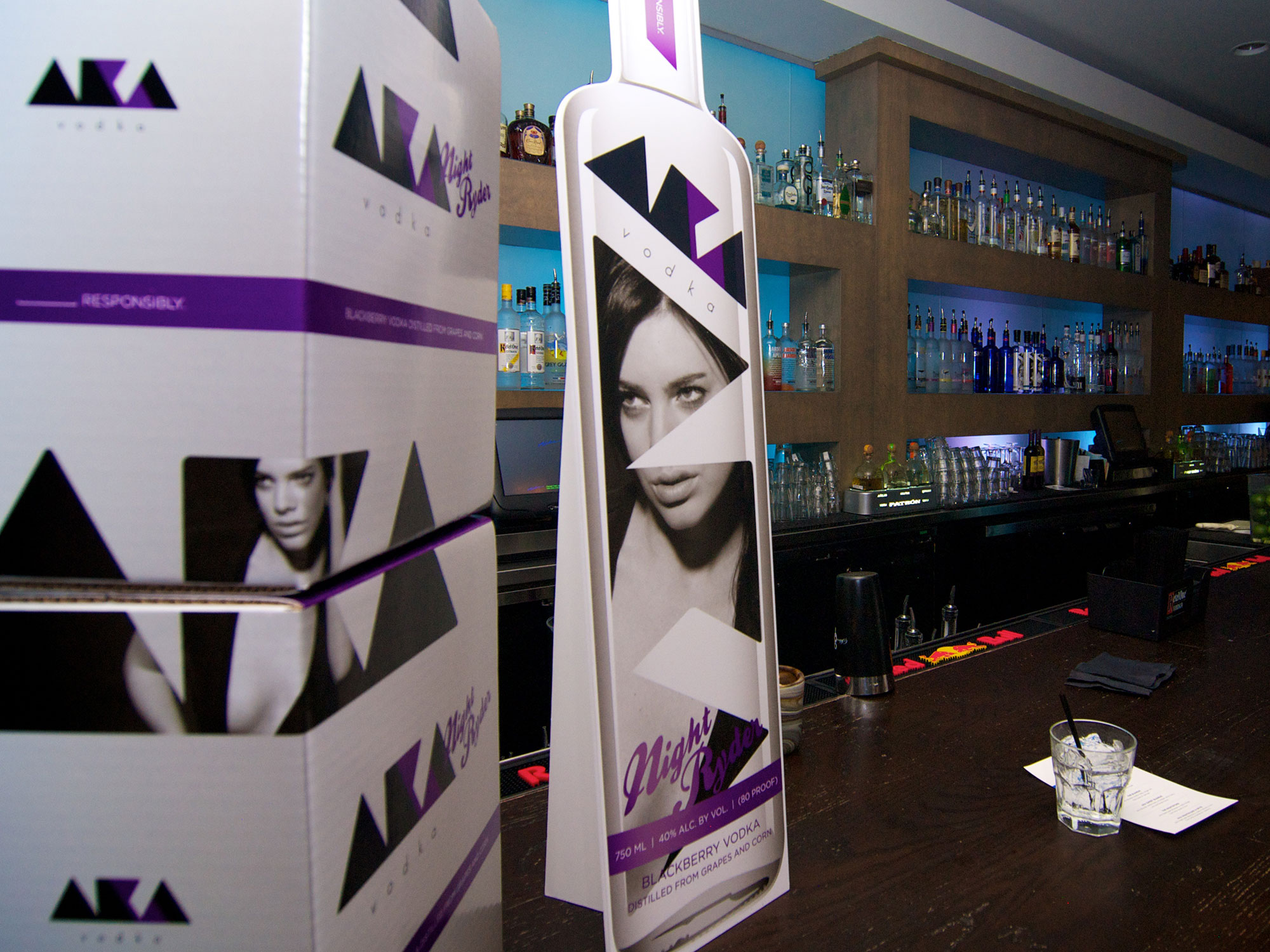
After establishing a bold, modern logo system, AKA Vodka needed packaging that would push the brand even further—something designed not just to hold the product, but to perform on the shelf and in stacked retail displays. The bottles and case boxes had to feel premium, fashion-forward, and unmistakably AKA, while using the brand’s signature female imagery in a way that felt innovative rather than decorative.
Nichez extended the brand identity into a highly visual packaging system that transforms the bottle and case boxes into storytelling elements. The design approach focused on layering, transparency, and scale—allowing the women featured in the logo to become a central part of the physical experience.
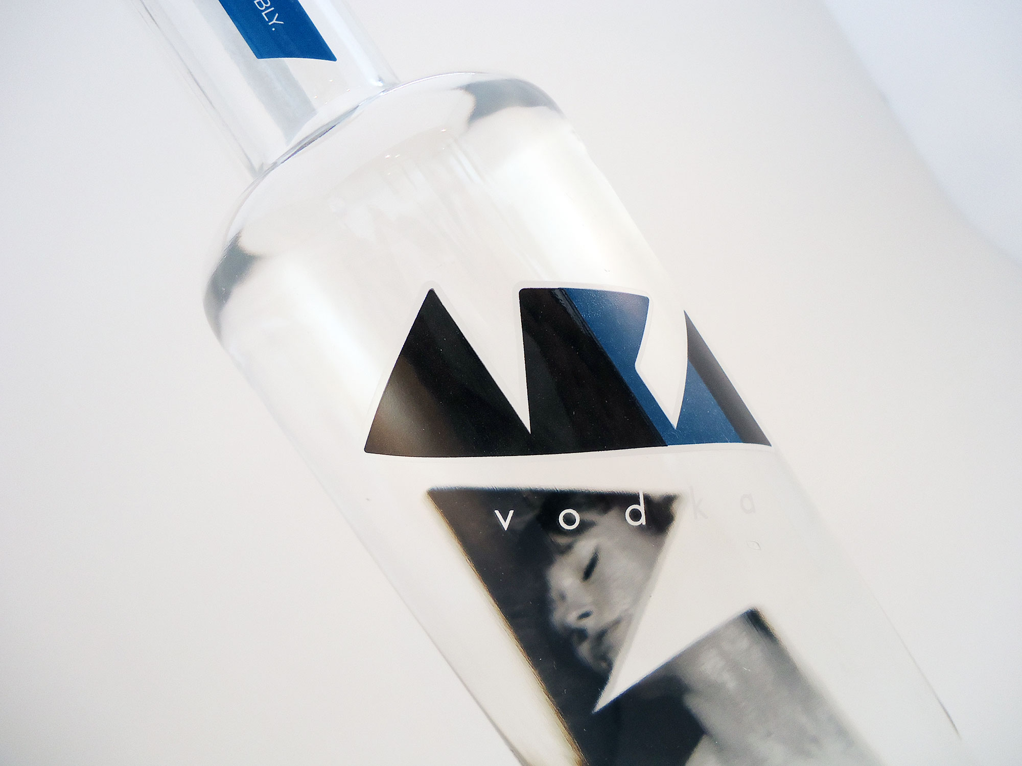
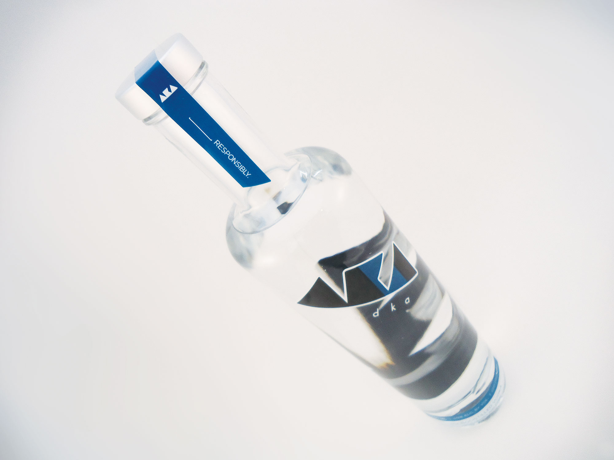
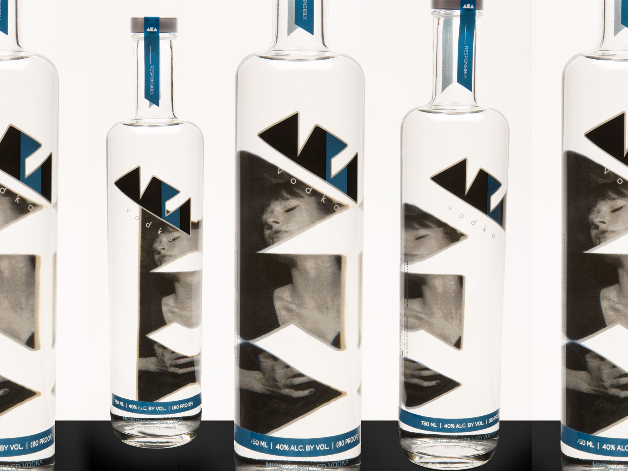
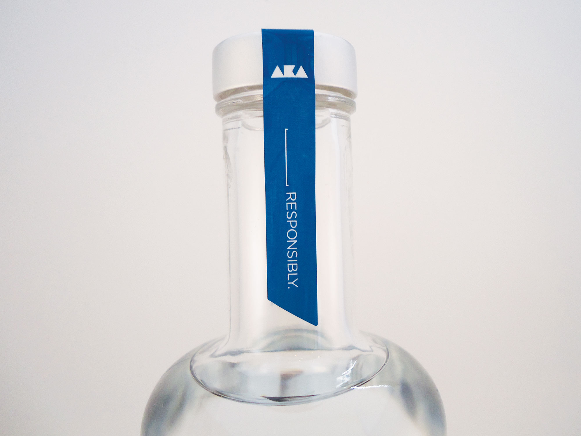
The AKA Vodka bottles were designed with a clean, modern silhouette that lets the graphics do the talking. The solid logo mark appears on the front of the bottle, while the imagery of the women is printed on the back of the glass.
When viewed from the front, the female figures subtly show through the vodka itself—creating depth, intrigue, and a sense of motion as the bottle is turned or lit. This unexpected reveal reinforces the brand’s premium feel and invites closer inspection, making the bottle stand out in both bar and retail environments.
Each flavor—Blondie, Night Ryder, and Original—features its own distinct model imagery, while maintaining a consistent bottle structure across the lineup.
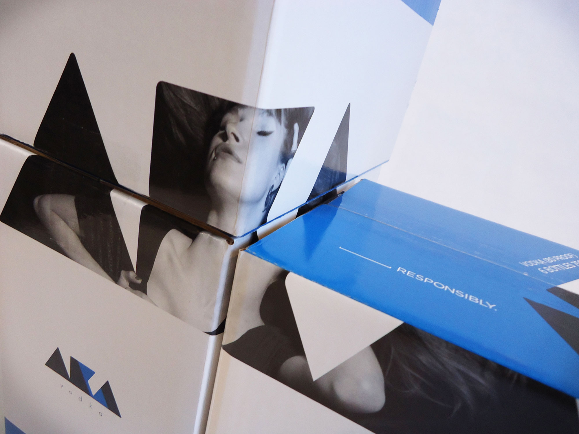
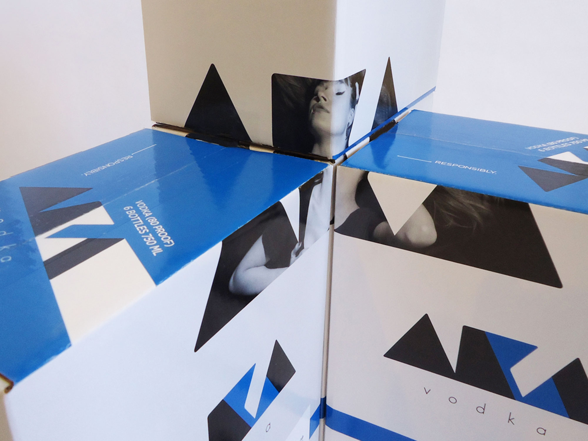
The case boxes were designed as more than protective packaging—they function as a visual display system. Each box features a cropped portion of the same female imagery used on the bottles. When cases are stacked together, the individual panels align to form a full-scale image of the model.
This approach turns warehouse stacks, retail backrooms, and floor displays into brand moments, allowing AKA Vodka to command attention even before a single bottle is removed.
From the backlit bar shelf to stacked cases on the sales floor, AKA Vodka packaging doesn’t just support the brand—it amplifies it.