.svg)
To understand why open space works so well, it helps to look beyond screens and pages—to architecture.
Frank Lloyd Wright was a master of guiding human attention through space. One of his most deliberate techniques appears before you ever reach the heart of his buildings. As he famously designed it, his entryways are always compressed.
“The entries to his buildings always have a relatively low ceiling, without exception,” one observer noted while walking through the dark entryway of a 3,200-square-foot home. “It provides a bit of compression so when you move through the house, and you emerge into the living spaces, the compression is relieved and you have the expansion and a much greater sense of the space that you move into.”
The effect is dramatic. You move from a pinched, narrow hallway into a living room drenched in light—glass windows and French doors opening to the outside. Suddenly, the space breathes. The ceiling lifts. The walls fall away. You feel suspended in a canopy of maple, oak, and black cherry trees, as if you’ve stepped into a treehouse hovering among the branches.
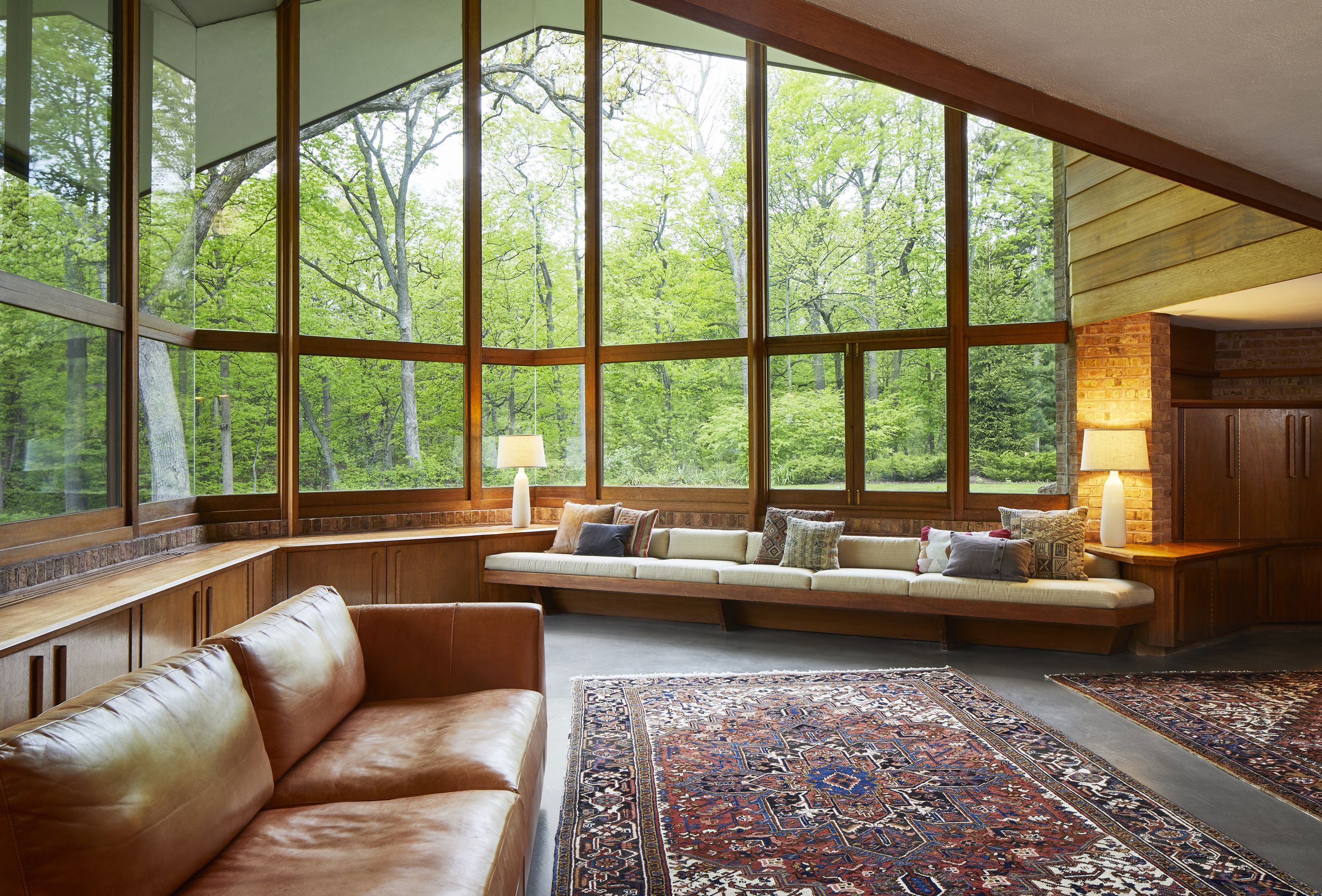
Wright didn’t compress the entry to make it uncomfortable. He did it so the release would feel intentional. The openness wasn’t accidental—it was earned. And when you arrive, your senses are heightened. You notice the light more. You appreciate the scale more. The space feels larger because you felt the tightness before it.
Open space gives meaning to content by framing it. When margins are generous, when layouts breathe, when elements aren’t fighting for attention, the eye knows exactly where to go. Headlines feel more important. Images feel more impactful. Calls to action feel clearer—because they aren’t buried in clutter.
Just as Wright used compression to create expansion, designers can use restraint to create focus. White space isn’t empty—it’s directional. It’s the pause before the reveal. It’s the hallway that prepares you for the room.
When everything is loud, nothing is heard.
When everything is highlighted, nothing stands out.
Open space allows the message to arrive with clarity and confidence. It lets the viewer enter the design, move through it naturally, and experience the content the way it was intended—without distraction, without confusion.