.svg)
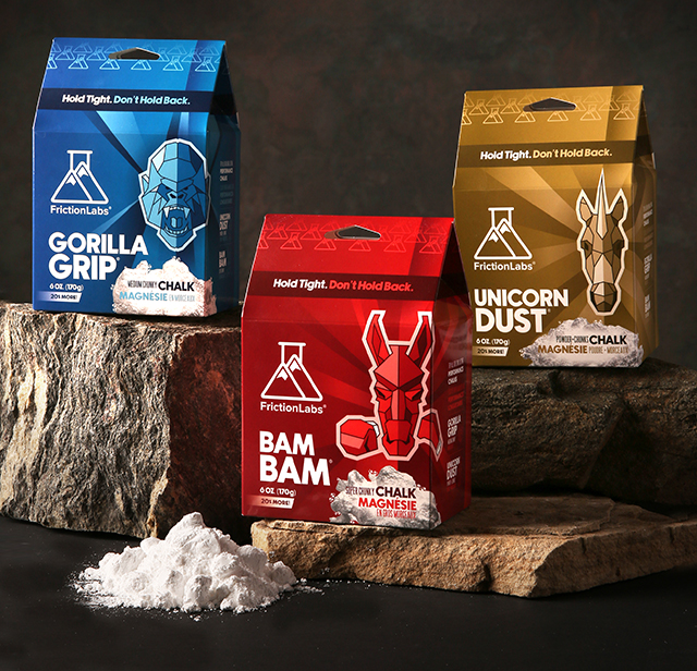
AKA Vodka set out to launch a bold, fashion-forward vodka brand designed to stand out in a crowded spirits market. The goal was to create a logo that felt super modern, edgy, and instantly recognizable—something that could live confidently on bottles, packaging, and social media while appealing to a style-conscious, nightlife-driven audience. The brand also needed a clear visual system to differentiate its three core flavors without losing cohesion.
Nichez designed a striking, solid-shape logo system that blends minimalism with attitude. At the core of the identity is a bold, graphic mark that houses stylized imagery of three different women—each one symbolizing the personality and flavor profile of the vodka.
Rather than relying on traditional vodka cues, the logo leans into lifestyle and persona, making AKA feel more like a fashion label than a liquor brand.
Each variation of the logo features a distinct female figure, carefully crafted to reflect the character of the vodka:
Despite their individuality, all three designs share the same solid logo structure, ensuring instant brand recognition across the entire product line.
The final logo system positions AKA Vodka as a bold, trend-driven brand with a distinct point of view. By combining strong graphic shapes with evocative character imagery, Nichez created an identity that feels modern, memorable, and built for expansion—perfectly suited for a vodka brand that wants to be seen, shared, and talked about.
AKA Vodka doesn’t just sit on the shelf—it makes a statement.