.svg)
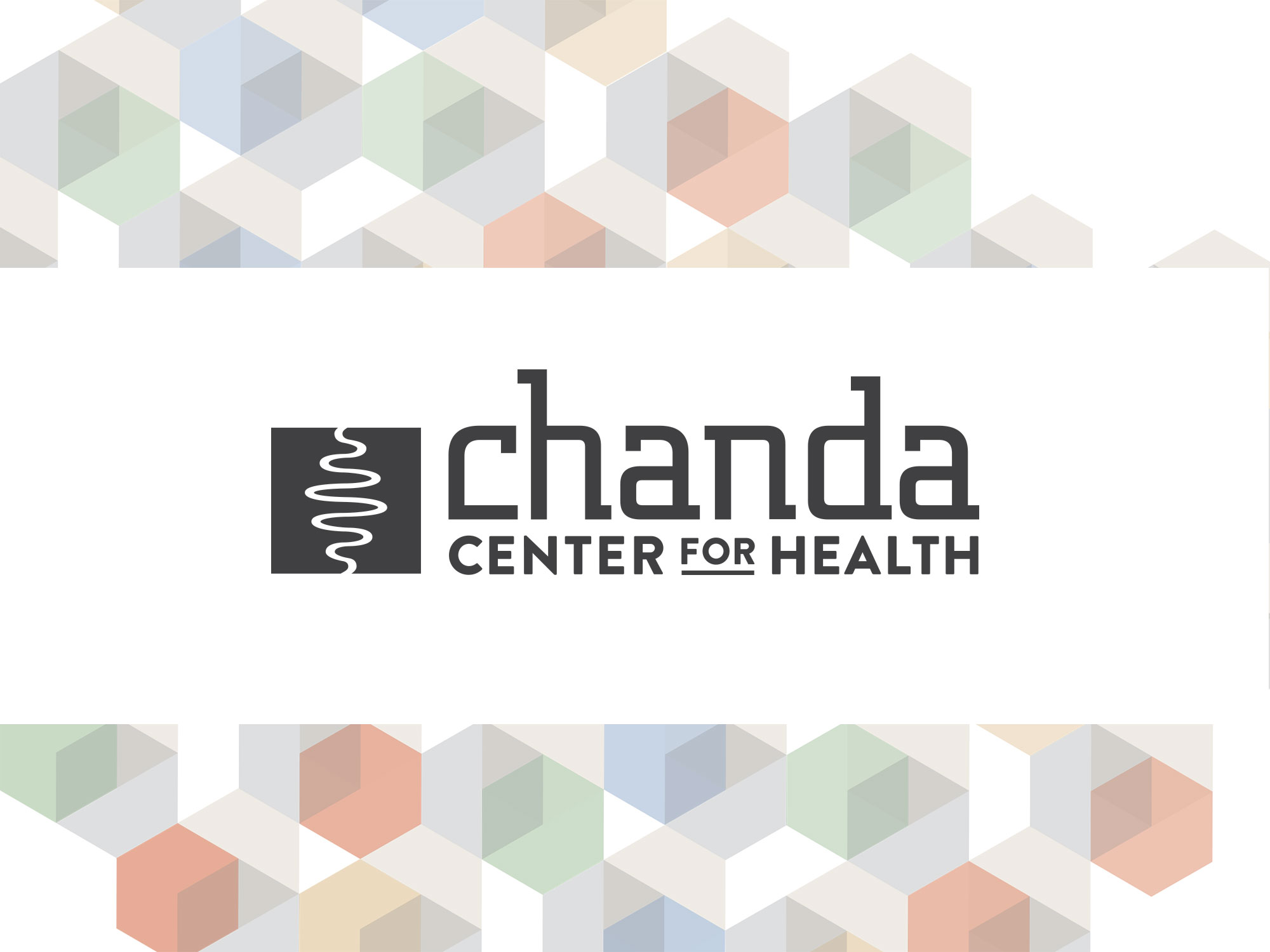
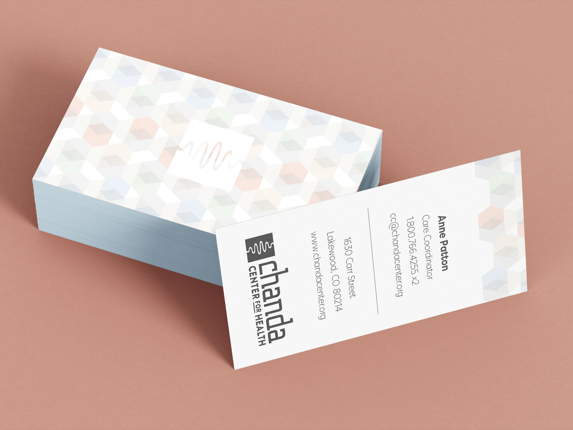
Chanda Center for Health provides integrative care for individuals living with spinal cord injuries, supporting healing, independence, and long-term wellness. Nichez was tasked with creating a logo that could clearly communicate the organization’s purpose while balancing clinical credibility with compassion and humanity.
The resulting mark is a simple, meaningful symbol that reflects care, connection, and the central role Chanda Center plays in each patient’s journey.
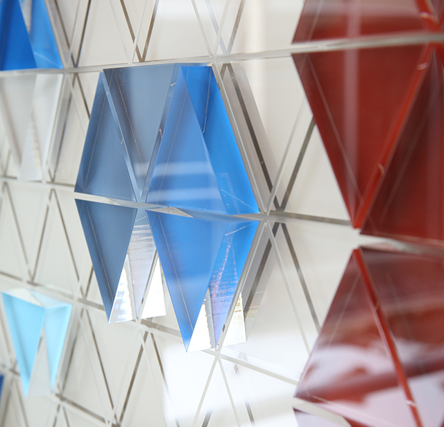
Nichez developed a symbolic mark built from layered meaning and intentional simplicity.
Together, these elements form a cohesive symbol that communicates care, structure, and hope without relying on literal or medical imagery.
The final logo is a versatile, modern mark that feels both professional and deeply human. Its geometric structure ensures clarity and consistency across applications, while the organic linework introduces warmth and empathy.
The logo system was designed to: