Commercial Roof Brokers Group (CRBG) needed a brand identity that felt firmly rooted in the commercial roofing industry while still standing apart from the category’s predictable visual language. The logo had to communicate protection, expertise, and trust—without feeling generic or overly literal.
Nichez explored architectural geometry, structural silhouettes, and the themes of coverage and protection that define CRBG’s work. The goal: create a modern, recognizable mark that blends industry familiarity with distinct visual character.
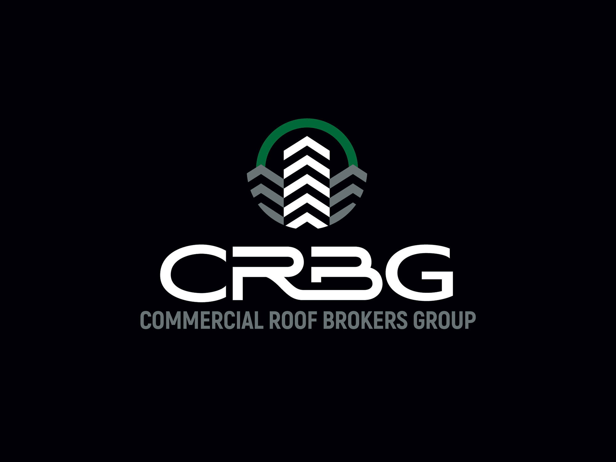
The resulting logo features a bold, simplified roofline inspired by commercial building profiles. This form is paired with a shield-like upper contour, symbolizing CRBG’s core purpose—protecting properties from the elements above. The combination creates a mark that is both structural and symbolic, professional yet memorable. A clean, confident wordmark completes the system, ensuring flexibility across signage, uniforms, digital platforms, and printed materials.
The new identity gives CRBG a strong visual foundation that conveys reliability and industry expertise while differentiating them from traditional roofing competitors.
The logo’s dual metaphor—building + shield—provides lasting meaning and a brand story CRBG can grow with.

