.svg)
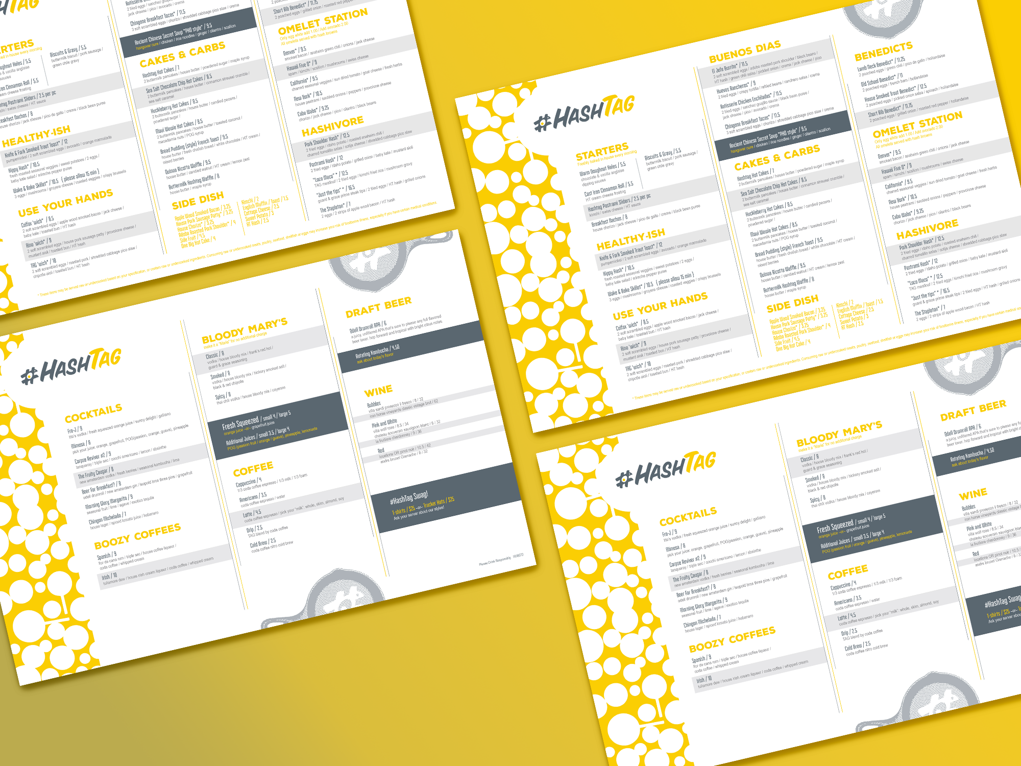
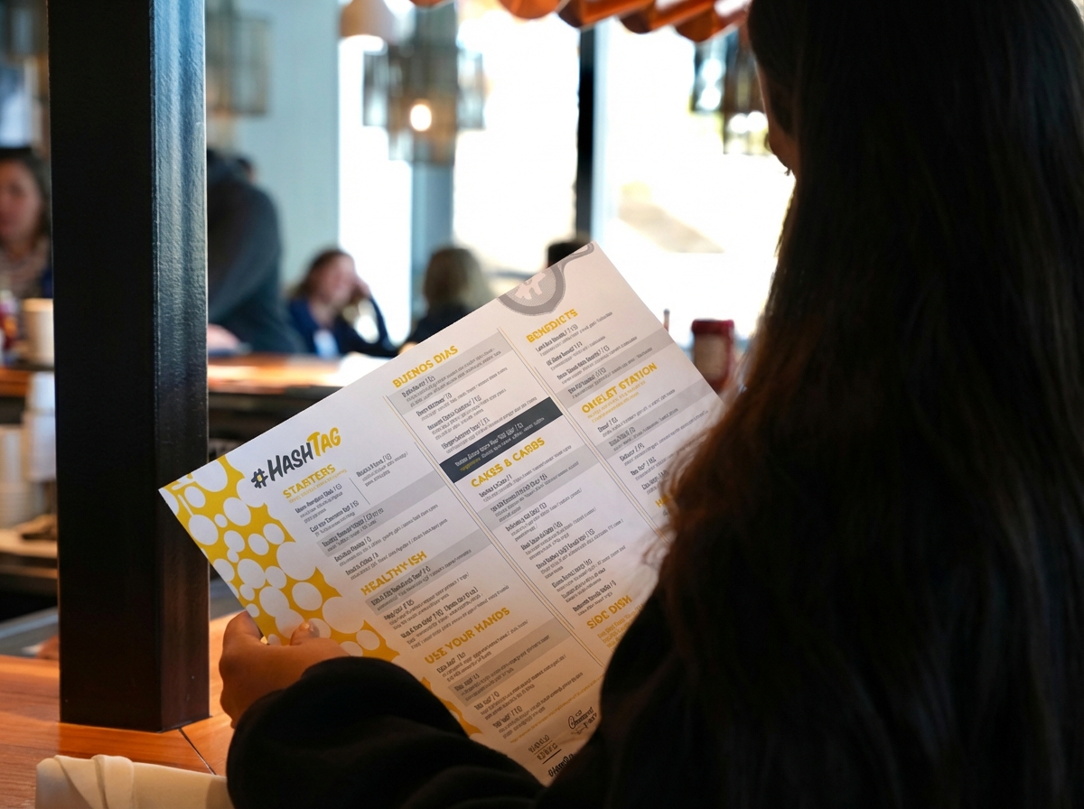
As Hashtag Restaurant expanded, the menu needed to do more than list items—it needed to reinforce the brand experience. With high-energy brunch service and a strong visual identity already in place, the menus had to be bold, easy to navigate, and unmistakably Hashtag.
The system also had to work across multiple locations, hold up to heavy daily use, and scale as new items and cocktails were introduced.
Nichez built the entire menu program around a central visual motif: the frying pan graphic and pattern.
Inspired by cast iron skillets—the same visual foundation used in signage and environmental design—the frying pan became both a structural and decorative device. It tied the food to its source while reinforcing the grounded, comfort-driven personality of the brand.
The result was a menu system that felt cohesive with the restaurant’s interiors, apparel, and identity—never disconnected.
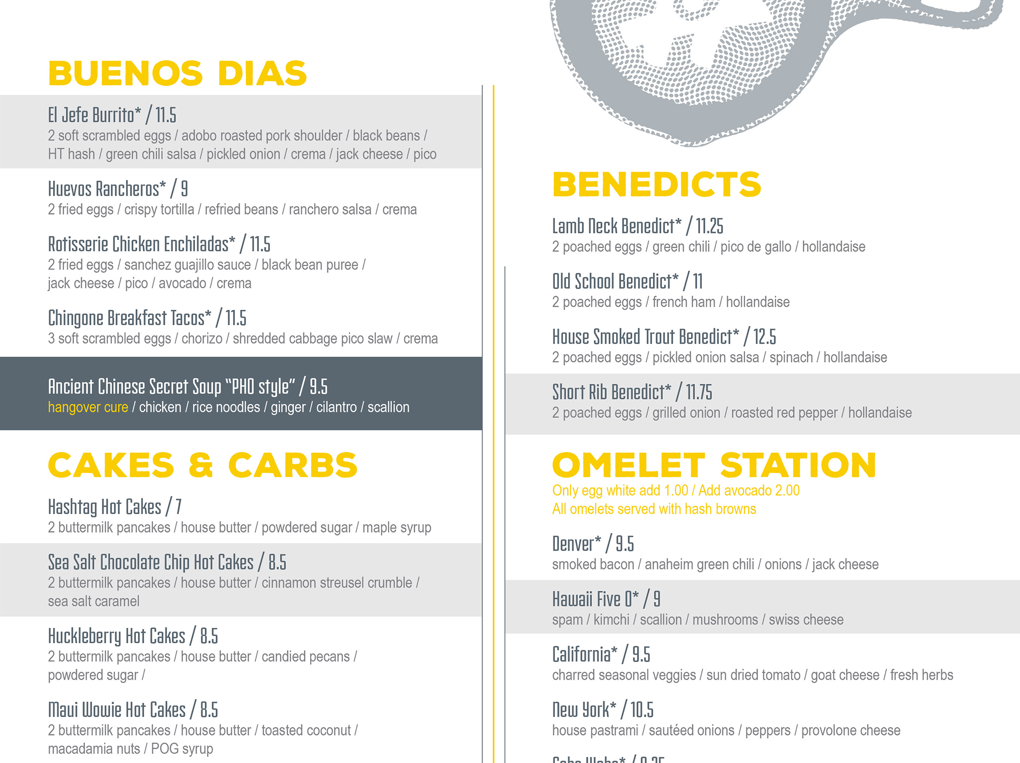
Main Food Menu
The food menu was designed with bold hierarchy and clean organization to support fast-paced brunch service.
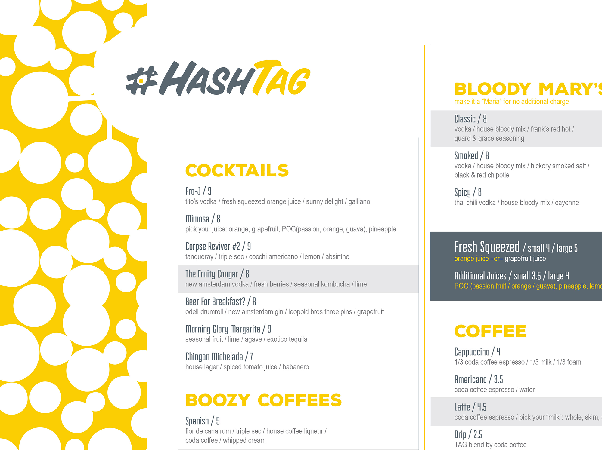
Cocktail Menu
The cocktail menu leans further into the boozy brunch vibe while maintaining visual consistency.
The menu program unified the Hashtag brand across all touchpoints. Guests move seamlessly from signage to interior graphics to menus without visual disruption. As Hashtag has grown to four locations, the scalable design system allows for easy updates and consistent brand expression in every market.