.svg)
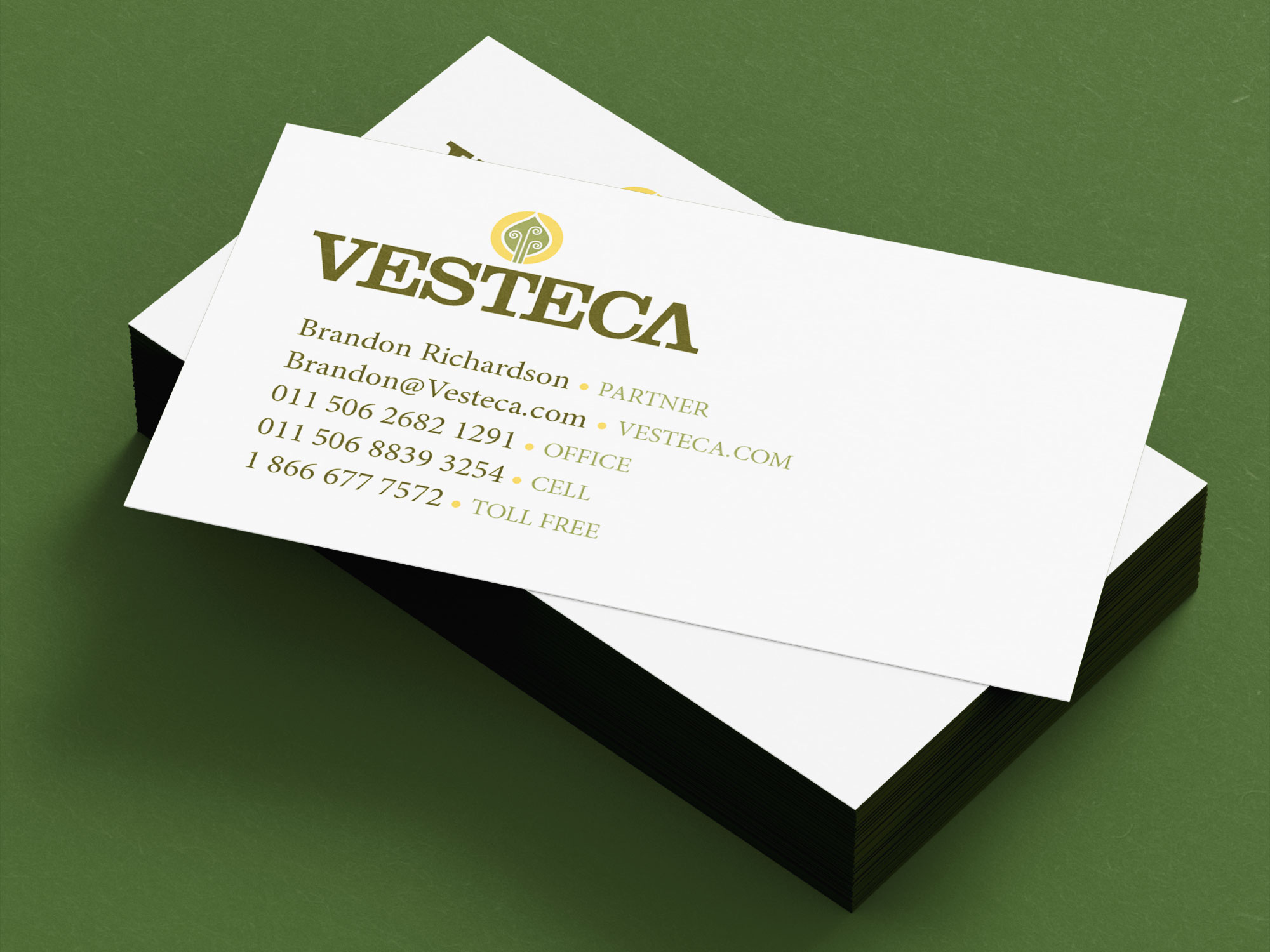
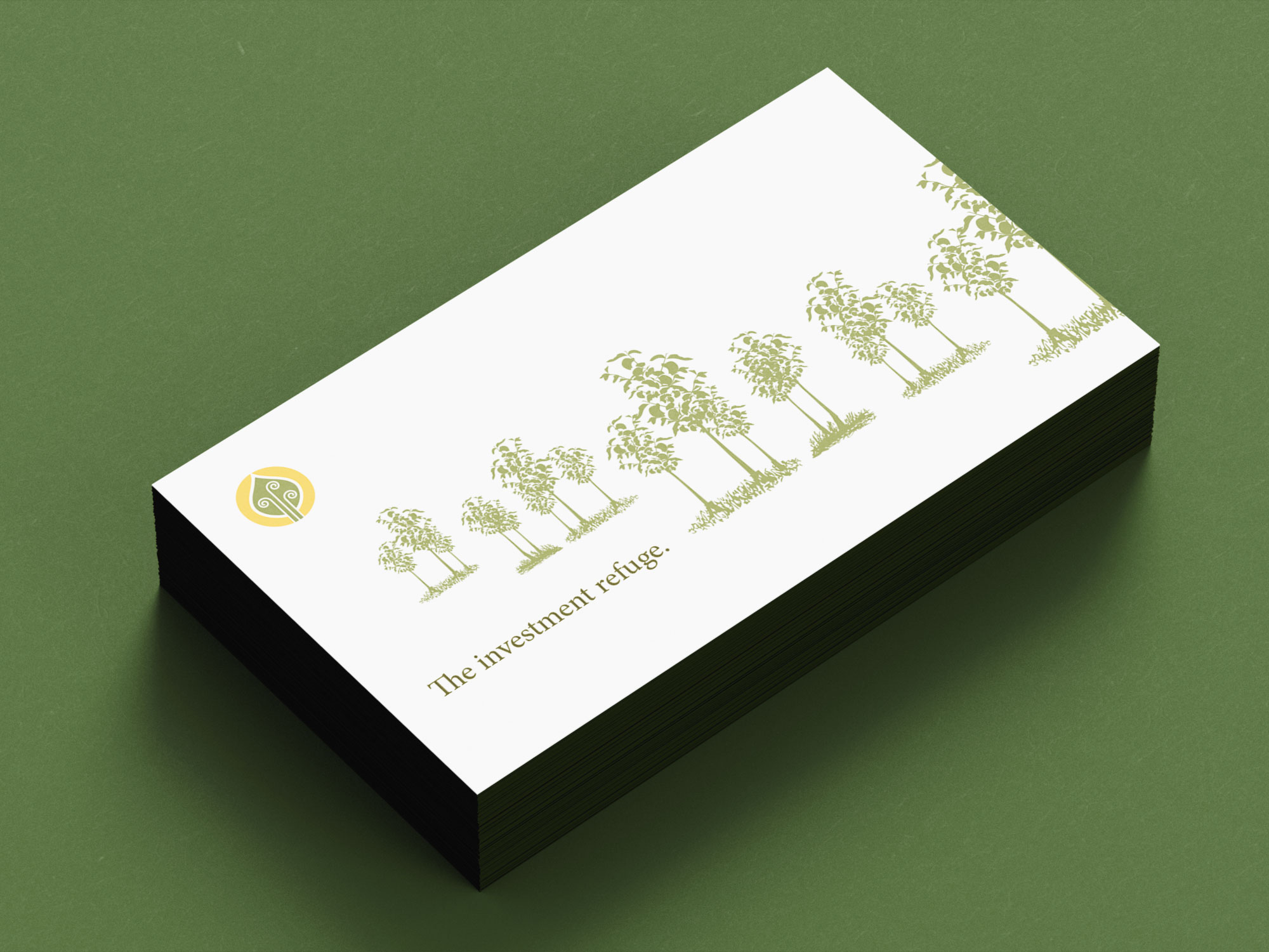
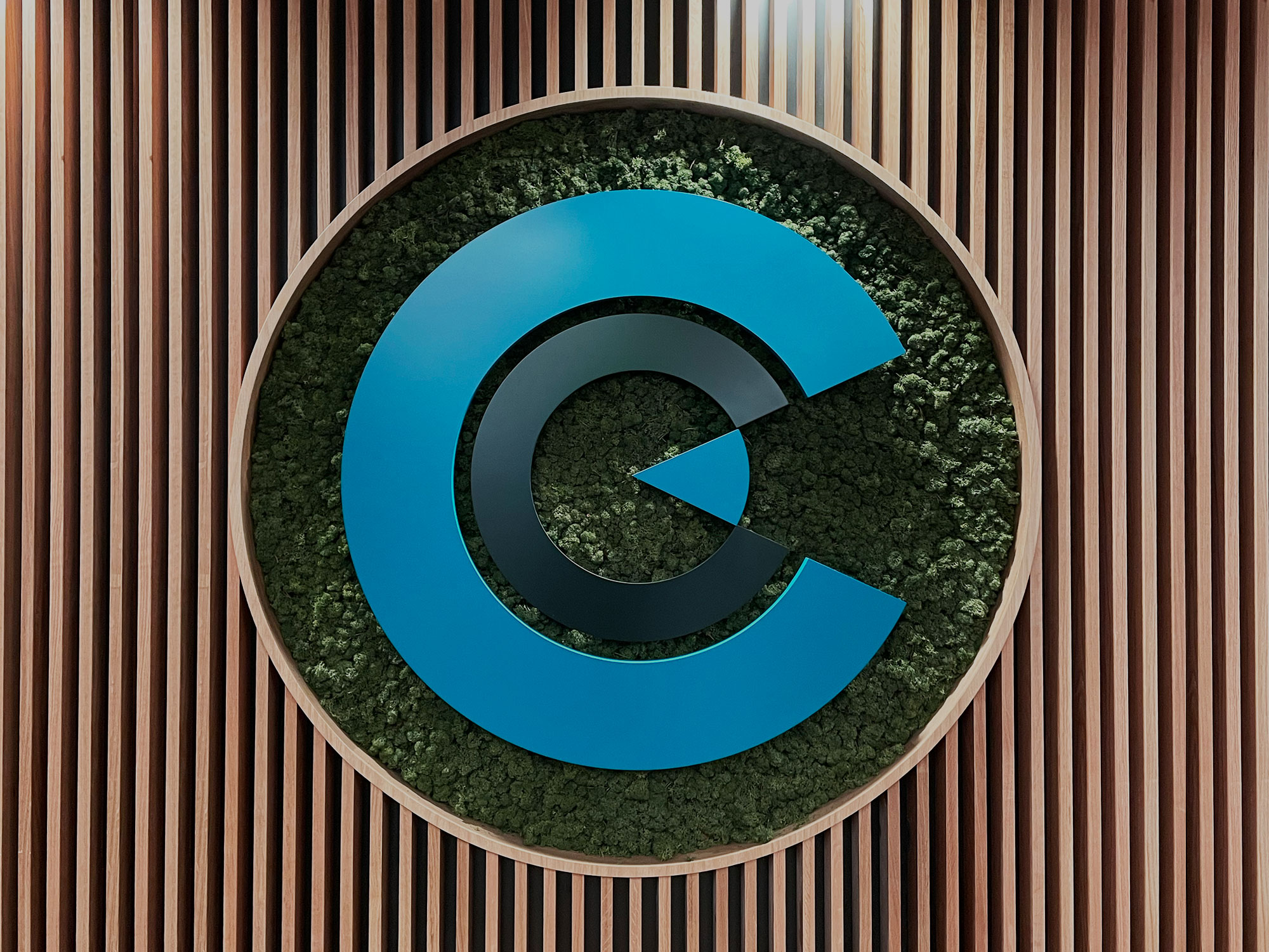
The Vesteca logo was designed to visually express the brand’s core promise: a modern investment model rooted in a fast-growing, renewable natural resource. With teak farms at the center of Vesteca’s offering, the logo needed to feel both organic and financial—bridging the trust required of an investment brand with the vitality of sustainable growth.
The final mark is inspired by a teak leaf, with an abstracted vein structure that forms a subtle spiral—symbolizing renewal, compounding growth, and long-term value creation.
The logo needed to:
We began by studying the teak leaf itself—specifically its vein structure. Rather than recreating the leaf in a realistic way, we focused on its underlying geometry.
The veins of a teak leaf naturally radiate and curve outward from a central point. By simplifying and refining these lines, we discovered an opportunity to introduce a spiral form—a universally understood symbol of:
This abstraction allowed the mark to reference teak conceptually, rather than literally.