.svg)

Ziggi’s Coffee needed a logo that could scale with a growing brand while capturing the emotional core of the coffee experience—warmth, comfort, and daily ritual. The mark had to be simple enough for cups and signage, yet distinctive enough to stand out in a highly competitive coffee landscape.
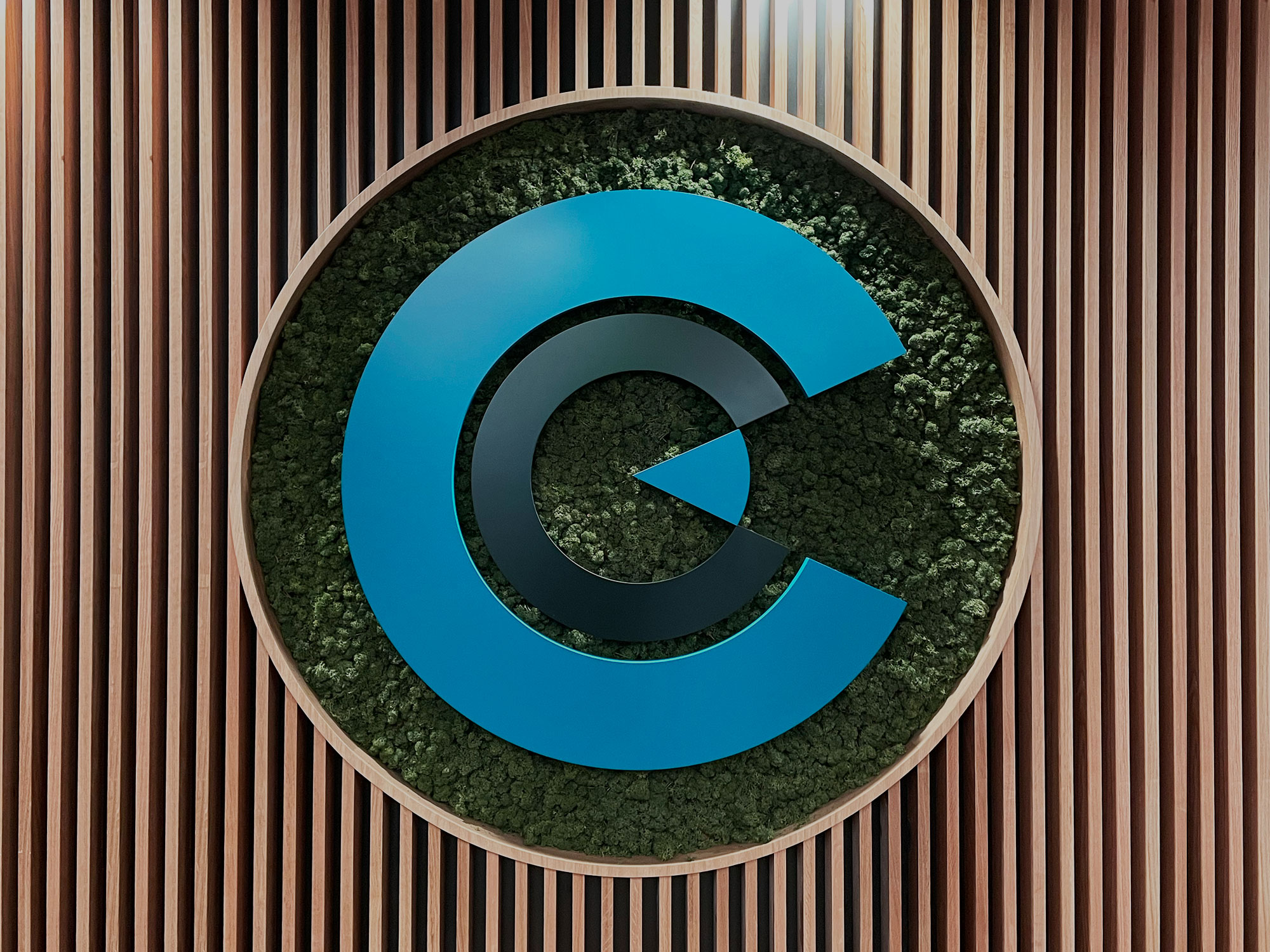
Nichez developed a concept rooted in a familiar perspective: a bird’s-eye view of a cup of coffee. This top-down angle created a natural, circular foundation for the logo while allowing for a subtle but memorable brand integration.
Within the cup, the swirling motion of a latte was carefully shaped to form a stylized “Z”—a hidden detail that ties directly to the Ziggi’s name without feeling forced or overly literal. The result is a mark that feels both intuitive and clever, revealing more the longer you look at it.
The color palette was chosen to evoke the sensory experience of coffee itself:
Together, the colors create an emotional connection—making the logo feel as warm as the product it represents.
The final logo gives Ziggi’s Coffee a distinctive and meaningful visual identity that connects directly to its product while reinforcing brand recognition. The subtle “Z” within the latte swirl adds a layer of sophistication, turning a simple cup of coffee into a memorable brand mark.
Nichez delivered a logo that doesn’t just represent coffee—it captures the feeling of it.